- Version notes
- AMP story format
- Story: amp-story
- Example
- Metadata guidelines
- Story generator meta tags
- Landscape orientation and full bleed desktop experience opt in
- Live story
- Children (of amp-story)
- Attributes
- standalone (required)
- title (required)
- publisher (required)
- publisher-logo-src (required)
- poster-portrait-src (required)
- poster-square-src (optional)
- poster-landscape-src (optional)
- entity (optional)
- entity-logo-src (optional)
- entity-url (optional)
- supports-landscape (optional)
- background-audio (optional)
- live-story (optional)
- live-story-disabled (optional)
- data-poll-interval (optional)
- desktop-aspect-ratio (optional)
- Animations
- Animation effects
- Animation attributes
- animate-in [required]
- animate-in-duration [optional]
- animate-in-timing-function [optional]
- animate-in-delay [optional]
- animate-in-after [optional]
- scale-start, scale-end [optional, only works with zoom-in & zoom-out animations]
- translate-x [optional, only works with pan-left & pan-right animations]
- translate-y [optional, only works with pan-up & pan-down animations]
- pan-scaling-factor [optional, only works with pan-left, pan-right, pan-up, & pan-down animations]
- Sequencing animations
- Combining multiple animations
- Branching
- Localization
- Related resources
- Validation
Important: this documentation is not applicable to your currently selected format websites!
amp-story
Description
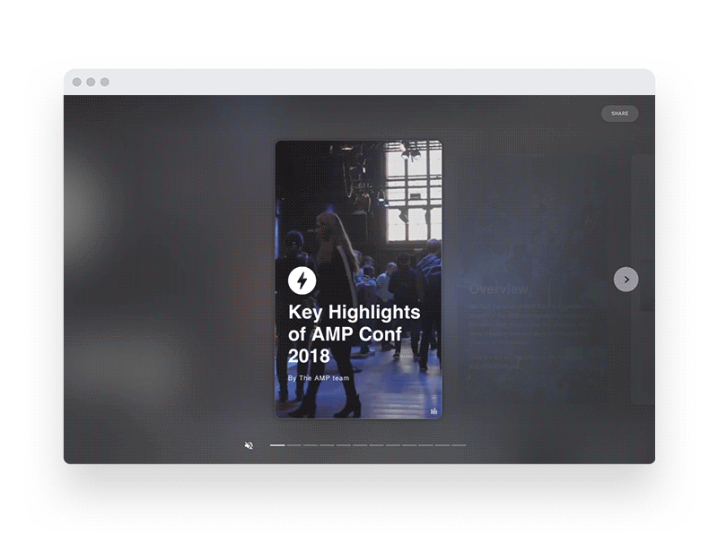
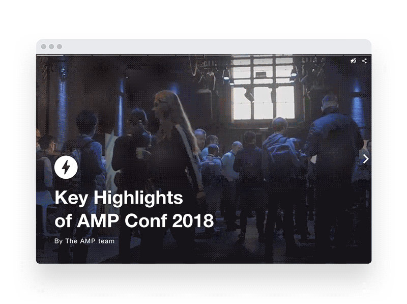
A rich, visual storytelling format.
Required Scripts
<script async custom-element="amp-story" src="https://cdn.ampproject.org/v0/amp-story-1.0.js"></script>
Web stories are an immersive, tappable and easily shareable storytelling format. Web stories are built using the AMP Framework. The amp-story component provides the AMP story subset of AMP. It is the base technology for web stories.

Version notes
| Version | Description |
|---|---|
| 1.0 | Current version, since 2018-07-16. |
AMP story format
An AMP story is a complete AMP HTML document that is comprised of pages, within the pages are layers, within the layers are AMP & HTML elements, like media, analytics, text, and so on.

Boilerplate
The following markup is a decent starting point or boilerplate. Copy this and save it to a file with a .html extension.
<!DOCTYPE html>
<html amp lang="en">
  <head>
    <meta charset="utf-8" />
    <script async src="https://cdn.ampproject.org/v0.js"></script>
    <script
      async
      custom-element="amp-story"
      src="https://cdn.ampproject.org/v0/amp-story-1.0.js"
    ></script>
    <title>Hello, amp-story</title>
    <link rel="canonical" href="http://example.ampproject.org/my-story.html" />
    <meta
      name="viewport"
      content="width=device-width,minimum-scale=1,initial-scale=1"
    />
    <style amp-boilerplate>
      body {
        -webkit-animation: -amp-start 8s steps(1, end) 0s 1 normal both;
        -moz-animation: -amp-start 8s steps(1, end) 0s 1 normal both;
        -ms-animation: -amp-start 8s steps(1, end) 0s 1 normal both;
        animation: -amp-start 8s steps(1, end) 0s 1 normal both;
      }
      @-webkit-keyframes -amp-start {
        from {
          visibility: hidden;
        }
        to {
          visibility: visible;
        }
      }
      @-moz-keyframes -amp-start {
        from {
          visibility: hidden;
        }
        to {
          visibility: visible;
        }
      }
      @-ms-keyframes -amp-start {
        from {
          visibility: hidden;
        }
        to {
          visibility: visible;
        }
      }
      @-o-keyframes -amp-start {
        from {
          visibility: hidden;
        }
        to {
          visibility: visible;
        }
      }
      @keyframes -amp-start {
        from {
          visibility: hidden;
        }
        to {
          visibility: visible;
        }
      }
    </style>
    <noscript
      ><style amp-boilerplate>
        body {
          -webkit-animation: none;
          -moz-animation: none;
          -ms-animation: none;
          animation: none;
        }
      </style></noscript
    >
  </head>
  <body>
    <amp-story
      standalone
      title="Hello Story"
      publisher="The AMP Team"
      publisher-logo-src="https://example.com/logo/1x1.png"
      poster-portrait-src="https://example.com/my-story/poster/3x4.jpg"
    >
      <amp-story-page id="my-first-page">
        <amp-story-grid-layer template="fill">
          <amp-img
            src="https://example.ampproject.org/helloworld/bg1.jpg"
            width="900"
            height="1600"
            alt=""
          >
          </amp-img>
        </amp-story-grid-layer>
        <amp-story-grid-layer template="vertical">
          <h1>Hello, amp-story!</h1>
        </amp-story-grid-layer>
      </amp-story-page>
      <amp-story-page id="my-second-page">
        <amp-story-grid-layer template="fill">
          <amp-img
            src="https://example.ampproject.org/helloworld/bg2.gif"
            width="900"
            height="1600"
            alt=""
          >
          </amp-img>
        </amp-story-grid-layer>
        <amp-story-grid-layer template="vertical">
          <h1>The End</h1>
        </amp-story-grid-layer>
      </amp-story-page>
    </amp-story>
  </body>
</html>
The content in the body creates a story with two pages. Each page has a full bleed background image, with a simple string of text on top of it.
Required markup for amp-story
The AMP story HTML format follows the same markup requirements as a valid AMP HTML document, along with the following additional requirements:
| RULE | DESCRIPTION |
|---|---|
The <amp-story standalone> element is the only child element of <body>. |
Identifies that the document is an AMP story. |
Contain a <script async src="https://cdn.ampproject.org/v0/amp-story-1.0.js" custom-element="amp-story"></script> tag as the third child of the <head> tag. |
Includes and loads the amp-story JS library. |
Contain a <link rel="canonical" href="$STORY_URL"> tag inside the <head>. |
The link points to the story itself, identifying the story as the canonical document. |
Story: amp-story
The amp-story component represents an entire story. The component itself implements the UI shell, including handling gestures and navigation, and inserting the application shell UI (controls, progress bar, etc).
Example
<amp-story
  standalone
  title="My Story"
  publisher="The AMP Team"
  publisher-logo-src="https://example.com/logo/1x1.png"
  poster-portrait-src="https://example.com/my-story/poster/3x4.jpg"
  poster-square-src="https://example.com/my-story/poster/1x1.jpg"
  poster-landscape-src="https://example.com/my-story/poster/4x3.jpg"
  background-audio="my.mp3"
>
  <amp-story-page>[...]</amp-story-page>
  <amp-story-page>[...]</amp-story-page>
  <amp-story-page>[...]</amp-story-page>
</amp-story>
Metadata guidelines
Metadata attributes display a preview of the story across the Web Stories ecosystem, such as rendering an engaging preview link. These attributes future-proof your story for rich, embedded experience Web Stories surfaces to come.
These metadata attributes supplement and do not replace any Structured Data (e.g. JSON-LD) on the page. We still recommend adding Structured Data to your Web Stories.
publisher-logo-src guidelines
These guidelines apply to the publisher logo image:
- Provide a raster file, such as
.jpg,.png, or.gif. Avoid vector files, such as.svgor.eps. - Avoid animated images, such as animated gifs.
- Image logo should be legible on the background color.
 |  |  |
- Logos should be at least 96x96 pixels and a perfect square.
- The background should not be transparent.
- Use one logo per brand that is consistent across AMP stories.
Poster guidelines (for poster-portrait-src, poster-landscape-src, and poster-square-src)
These guidelines apply to the story poster image(s):
- The poster image should be representative of the entire AMP story.
- The poster image should be visible to the user when the AMP story begins. To accommodate sizing, cropping or minor styling changes or preview purposes, the image file URL used in the metadata does not need to be an exact match to the URL on the first page of the story.
- Provide a raster file, such as
.jpg,.png, or.gif. Avoid vector files, such as.svgor.eps. - The poster image should be in 3x4 aspect ratio for portrait, 4x3 for landscape, and 1x1 for square.
- If the poster image is derived from a frame in a video, the thumbnail should be representative of the video. For example, the first frame in a video is often not representative.
- Each poster image should meet the recommended minimum size:
- Portrait: 640px x 853px
- Landscape: 853px x 640px
- Square: 640px x 640px
Story generator meta tags
Optional HTML meta tags can be used to indicate which Story generator the document was created with. There are two meta tags, respectively indicating the generator name and its version.
<meta name="amp-story-generator-name" content="Story generator name" />
<meta name="amp-story-generator-version" content="0.1" />
Landscape orientation and full bleed desktop experience opt in
If the supports-landscape attribute is specified on the <amp-story> element, it will:
- Allow the story to be seen when a mobile device is held in a landscape orientation.
- Change the desktop experience to an immersive full bleed mode, replacing the default three portrait panels experience.
While this is currently opt-in and optional, we strongly recommend making sure that users on mobile devices are able to view stories in whatever orientation best suits their needs - otherwise, they will simply be presented with a "The page is best viewed in portrait mode" message.
Usage: <amp-story ... supports-landscape>...</amp-story>
Live story

Use the live-story attribute to append new pages to a story for users to see in real-time.
This attribute shows a notification of new pages to users on the last page, and updates the progress bar.
Core use cases for live-story include coverage for breaking news or live events, enabling real-time updates to users without exiting the story. Award shows, sporting events, and elections are some examples.
How it works
In the background, while an AMP Story using live-story is displayed on the client, the AMP runtime polls the origin document on the host for updates. When the client receives a response, it then filters and dynamically inserts those updates back into the story on the client. Publishers can customize the polling rate in order to control the number of incoming requests, and AMP caches like the Google AMP Cache can perform optimizations to reduce the server response payload, saving client bandwidth and CPU cycles.
Polling
In most implementations for live blogs, content is either pushed by the server to the client instance of a page, or the client polls a JSON endpoint to receive updates. The implementation here is different, in that the client instance of the story polls the server copy of the story document for updates inside the <amp-story> element. For instance: if the user is viewing a story served from an AMP cache, the client will poll that document hosted on that AMP cache for updates; if the user is viewing a document served from a web publisher's origin domain (e.g. "example.com"), then the client will poll the document hosted on that origin domain for updates.
This means that publishers of stories do not need to set up a JSON endpoint or push mechanism for this functionality to work.
Content is updated by publishing to the same URL with valid <amp-story> markup. The content is pulled into the user's client instance during the next poll. Poll intervals are configurable using the data-poll-interval attribute.
Stop polling
As long as the live-story attribute is present on the <amp-story> element, the client will make continuous polls to the server copy of the document. Make sure to set the live-story-disabled attribute to the <amp-story> element when you publish your last update to the story. This will make the polling stop.
Usage
- Specify an
idon the<amp-story>element. - Add the
live-storyattribute to the<amp-story>element. - [Optional] Add the
data-poll-intervalattribute to the<amp-story>element to specify a time interval for checking for new updates. - [Optional] When finishing the live broadcast, add the
live-story-disabledattribute to the<amp-story>element to disable the polling. - On each
<amp-story-page>:- Specify a
data-sort-timeattribute with a valid value. This is a timestamp used for sorting the pages. Higher timestamps will be inserted after older page entries. We recommend using Unix time.
- Specify a
<amp-story id="story1" live-story ...>
  <amp-story-page id="cover" data-sort-time="1552330790"> ... </amp-story-page>
  <amp-story-page id="page1" data-sort-time="1552330791"> ... </amp-story-page>
  <amp-story-page id="page2" data-sort-time="1552330792"> ... </amp-story-page>
</amp-story>
Children (of amp-story)
The <amp-story> component contains one or more <amp-story-page> components, containing each of the individual screens of the story. The first page specified in the document order is the first page shown in the story.
Optional customization
Crop amp-img and amp-video assets using object-position
The object-position attribute can be used on <amp-img> and <amp-video> elements to specify the alignment of the asset within its container (crop).
By default these assets are centered and, depending on the viewport ratio, have their edges are cropped out of the container. Because the zone of interest of an asset is not always its center, the object-position allows specifying what part of the image has to remain visible.
This attribute accepts any value accepted by the object-position CSS property.
Example:

This same image can be used for both mobile portrait and landscape desktop using the object-position this way:
<amp-img src="cat.jpg" alt="..." object-position="75% 40%"></amp-img>
Optimize amp-video by using a free Google hosted video cache on origin documents
The <amp-video> element on stories supports the Google video cache to be used on origin documents through the attribute cache="google". The video cache will fetch and store the video contents periodically, reducing serving costs for videos, and generating transcodes with different quality settings that adapt the bitrate to the network conditions.
Use 720p videos or higher to take advantage of all the video transcodes and adaptive bitrate algorithms.
Example:
<amp-video layout="fill" poster="img.png" cache="google" autoplay>
  <source src="video.mp4" type="video/mp4">
</amp-video>
data-text-background-color
The data-text-background-color attribute highlights the text of the element with a specified color. To highlight the entire block, add this attribute directly to the text element. To only highlight the text, add the attribute and text to an inner . Note that works anywhere inside an <amp-story-page>, not just in <amp-story-grid-layer>.
Example:

<amp-story-grid-layer template="vertical">
  <h2>
    <span data-text-background-color="crimson">
      Cat ipsum dolor sit amet, sleeps on my head, but lounge in doorway so if
      human is on laptop sit on the keyboard
    </span>
  </h2>
</amp-story-grid-layer>
Example:

<amp-story-grid-layer template="vertical">
  <h2 data-text-background-color="crimson">
    Cat ipsum dolor sit amet, sleeps on my head, but lounge in doorway so if
    human is on laptop sit on the keyboard
  </h2>
</amp-story-grid-layer>
Embedded components
We support embedding some components such as <amp-twitter> inside amp-story-grid-layer. By default they are not interactive in the story (i.e. tapping on them will advance to the next page), but by using the interactive attribute, you can show a tooltip linking to original source (i.e. opening the tweet on a new tab).
Example:
<amp-twitter
  width="100"
  height="100"
  layout="responsive"
  data-tweetid="1102562523524579328"
  interactive
>
</amp-twitter>
Links in amp-story-grid-layer
We support inline links <a> as a descendant of amp-story-grid-layer. Whenever a link is tapped a tooltip will be shown - deferring the corresponding action until the user taps again in the tooltip.
Please note the following guidelines for including links in your amp-story:
- Parts of links that are too far to the left or right edge of a story page will yield to navigation.
- Links that occupy too much of the page area will be ignored for navigation.
Customizing tooltip for links or interactive components
You can customize the contents of the tooltip displayed on top of a user interactive element by specifying the following attributes. If they are not specified, a fallback value will be provided automatically.
data-tooltip-icon
Takes in a src where the icon image is located.
data-tooltip-text
A string that will be shown when the tooltip appears.
Example:
<a
  href="https://www.google.com"
  role="link"
  data-tooltip-icon="./assets/ic_amp_googblue_1x_web_24dp.png"
  data-tooltip-text="Go to page"
>
  Click me!
</a>
Other components usable in AMP stories
The following are other components usable in AMP stories that require some story-specific caveats.
For more generally usable components see the list of allowed children.
Attributes
standalone (required)
Identifies that the AMP document is a story.
title (required)
The title of the story.
publisher (required)
The name of the story's publisher.
publisher-logo-src (required)
A URL to the story publisher's logo in square format (1x1 aspect ratio). For example publisher-logo-src="https://example.com/logo/1x1.png", where 1x1.png is a 96x96 px logo.
poster-portrait-src (required)
A URL to the story poster in portrait format (3x4 aspect ratio).
poster-square-src (optional)
A URL to the story poster in square format (1x1 aspect ratio).
poster-landscape-src (optional)
A URL to the story poster in landscape format (4x3 aspect ratio).
entity (optional)
The name of the story's creating entity. For example: entity="User", where User created the story on the publisher's platform.
entity-logo-src (optional)
A URL to the story creating entity's logo in square format (1x1 aspect ratio). For example entity-logo-src="https://example.com/logo/1x1.png", where 1x1.png is a 96x96 px logo.
entity-url (optional)
A URL to the story creating entity's platform. For example entity-url="https://example.com/profile/user", which links to User's profile on the publisher's platform.
supports-landscape (optional)
Enables landscape orientation support on mobile devices and a full bleed landscape experience on desktop devices.
background-audio (optional)
A URL to an audio file that plays throughout the story.
live-story (optional)
Enables the Live story functionality.
live-story-disabled (optional)
Disables the Live story functionality.
data-poll-interval (optional)
Used with the live-story attribute. Time interval (in milliseconds) between checks for new content. If no data-poll-interval is provided it with default to the 15000 millisecond minimum. A value under 15000 milliseconds is invalid.
desktop-aspect-ratio (optional)
The value specifies an aspect ratio in the "horizontal:vertical" format, where both "horizontal" and "vertical" are integer numbers. If this attribute is specified, the layout of the story in desktop one panel mode is set to conform to the specified proportions. The accepted ratio is between 1:2 and 3:4, and any values outside of the range would be clamped.
Animations
Every element inside an <amp-story-page> can have an entrance animation.
You can configure animations by specifying a set of animation attributes on the element; no additional AMP extensions or configuration is needed.
If there is something needed outside of the presets, custom animations can be configured using the <amp-story-animation> component.
Animation effects
The following animation effects are available as presets for AMP stories:
| Preset name | Default duration (ms) | Default delay (ms) |
|---|---|---|
drop |
1600 | 0 |
fade-in |
600 | 0 |
fly-in-bottom |
600 | 0 |
fly-in-left |
600 | 0 |
fly-in-right |
600 | 0 |
fly-in-top |
600 | 0 |
pulse |
600 | 0 |
rotate-in-left |
1000 | 0 |
rotate-in-right |
1000 | 0 |
scale-fade-down |
600 | 0 |
scale-fade-up |
600 | 0 |
twirl-in |
1000 | 0 |
whoosh-in-left |
600 | 0 |
whoosh-in-right |
600 | 0 |
pan-left |
1000 | 0 |
pan-right |
1000 | 0 |
pan-down |
1000 | 0 |
pan-up |
1000 | 0 |
zoom-in |
1000 | 0 |
zoom-out |
1000 | 0 |
Animation attributes
animate-in [required]
Use this attribute to specify the name of the entrance animation preset.
Example: A heading flies in from left of the page.
<h2 animate-in="fly-in-left">
  Fly from left!
</h2>
animate-in-duration [optional]
Use this attribute to specify the duration of the entrance animation, in seconds or milliseconds (e.g., 0.2s or 200ms). The default duration depends on the animation preset you specified.
Example: A heading flies in from left of the page and the animation finishes within half a second.
<h2 animate-in="fly-in-left" animate-in-duration="0.5s">
  Fly from left!
</h2>
animate-in-timing-function [optional]
Use this attribute to specify the timing function (animation curve) of the entrance animation. The default timing function depends on the animation preset you specified.
Example: A heading flies in from left of the page and the animation decelerates (ease-out).
<h2
  animate-in="fly-in-left"
  animate-in-timing-function="cubic-bezier(0.0, 0.0, 0.2, 1)"
>
  Fly from left!
</h2>
animate-in-delay [optional]
Use this attribute to specify the delay before starting the animation. The value must be greater than or equal to 0, in seconds or milliseconds (for example, 0.2s or 200ms). The default delay depends on the animation preset you specified.
Example: After 0.4 seconds, a heading flies in from the left of the page and completes its entrance within 0.5 seconds.
<h2 animate-in="fly-in-left" animate-in-duration="0.5s" animate-in-delay="0.4s">
  Fly from left!
</h2>
amp-animation extension in the background when the first animated element has been scanned. The attribute contract is defined as delay this animation for at least N milliseconds. This applies to all elements including those with a delay of 0 seconds. animate-in-after [optional]
Use this attribute to chain or sequence animations (for example, animation2 starts after animation1 is complete). Specify the ID of the animated element that this element's animation will follow. The element must be present on the same <amp-story-page>. The delay is applied after the previous element's animation has finished. For further details, see the Sequencing animations section below.
For example, in the following code, object2 animates in after object1 completes their entrance:
<amp-story-page id="page1">
  <amp-story-grid-layer template="vertical">
    <div id="object1" animate-in="rotate-in-left">
      1
    </div>
    <div id="object2" animate-in="fly-in-right" animate-in-after="object1">
      2
      <!-- will start after object1 has finished -->
    </div>
  </amp-story-grid-layer>
</amp-story-page>
scale-start, scale-end [optional, only works with zoom-in & zoom-out animations]
Use these two attributes to further specify the parameters of your zoom-in and zoom-out animations. The value must be greater than or equal to 0, and decimals are allowed. The default will be scale-start: 1 and scale-start: 3 for zoom-in, and the inverse for zoom-out.
Example: An image zooming-in from 2x to 5x its size over 4 seconds.
<amp-img
  animate-in="zoom-in"
  scale-start="2"
  scale-end="5"
  animate-in-duration="4s"
  layout="fixed"
  src="https://picsum.photos/720/320?image=1026"
  width="720"
  height="320"
  alt="..."
>
</amp-img>
translate-x [optional, only works with pan-left & pan-right animations]
Use this attribute to specify the horizontal panning of your image in a pan-left/pan-right animation. The value must be greater than or equal to 0 in pixels. The default value will pan the whole width of the specified image.
Example: An image panning 200px to the left over 10 seconds.
<amp-img
  animate-in="pan-left"
  translate-x="200px"
  animate-in-duration="10s"
  layout="fixed"
  src="https://picsum.photos/720/320?image=1026"
  width="720"
  height="320"
  alt="..."
>
</amp-img>
translate-y [optional, only works with pan-up & pan-down animations]
Use this attribute to specify the vertical panning of your image in a pan-up/pan-down animation. The value must be greater than or equal to 0 in pixels. The default value will pan the whole height of the specified image.
Example: An image panning 50px down over 15 seconds.
<amp-img
  animate-in="pan-down"
  translate-y="50px"
  animate-in-duration="15s"
  layout="fixed"
  src="https://picsum.photos/720/320?image=1026"
  width="720"
  height="320"
  alt="..."
>
</amp-img>
pan-scaling-factor [optional, only works with pan-left, pan-right, pan-up, & pan-down animations]
The target scales automatically in a pan-left/pan-right/pan-up/pan-down animation to ensure it does not go out of the target boundary when panning.
Use this attribute to override the default scaling factor calculation, and specify a static scaling factor. The value must be greater than 0, and decimals are allowed.
Example: An image scales 1.3x when panning.
<amp-img
  animate-in="pan-left"
  pan-scaling-factor="1.3"
  layout="fixed"
  src="https://picsum.photos/720/320?image=1026"
  width="720"
  height="320"
  alt="..."
>
</amp-img>
Sequencing animations
To chain animations in sequence, use the animate-in-after attribute. All elements in a given chain must be present in the same <amp-story-page>. Elements without the animate-in-after attribute do not belong to a sequence chain, and will start independently on page entrance.
<amp-story-page id="my-sequencing-page">
  <amp-story-grid-layer template="vertical">
    <div class="circle" animate-in="drop-in" animate-in-duration="1.8s">
      1
      <!-- will start independently -->
    </div>
    <div
      id="rotate-in-left-obj"
      class="square"
      animate-in="rotate-in-left"
      animate-in-after="fade-in-obj"
      animate-in-delay="0.2s"
    >
      2
      <!-- will start after fade-in-obj has finished -->
    </div>
    <div
      class="square"
      animate-in-after="rotate-in-left-obj"
      animate-in="whoosh-in-right"
      animate-in-delay="0.2s"
    >
      3
      <!-- will start after rotate-in-left-obj has finished -->
    </div>
    <div
      id="fade-in-obj"
      class="circle"
      animate-in="fade-in"
      animate-in-duration="2.2s"
    >
      1
      <!-- will start independently -->
    </div>
  </amp-story-grid-layer>
</amp-story-page>
Combining multiple animations
You can apply multiple entrance animations on one element (for example, an element flies into the page and fades in at the same time). It's not possible to assign more than one animation preset to a single element; however, elements with different entrance animations can be nested to combine them into one.
<div animate-in="fly-in-left">
  <div animate-in="fade-in">
    I will fly-in and fade-in!
  </div>
</div>
animate-in-after set to the same id. Branching
Branching enables the identification of individual story pages. Users can jump around within a story, start a story from somewhere other than the beginning, and share specific story pages. An example is a table of contents or multiple choice buttons.
Fragment parameters in the URL supports this feature.
Branching allows navigation manipulation within a story. The story tracks navigation. If a user navigates from page-1 to page-5 and then page-6, navigating backwards will follow the exact path. The skipped pages are not exposed to the user when navigating backwards, it will follow page-6, to page-5, and ends back at page-1.
URL Fragment Parameter
With branching, AMP Stories now supports URLs in the form of:
https://www.mydomain.com/good-story/#page=<page-id>
where page-id refers to the unique id of an amp-story-page. You can also use the fragment parameter and the page-id value like an anchor link in some use cases.
Localization
You should always include the language code in the lang attribute on the <html> tag of your story, such as <html ⚡ lang="en"> for English content. The supported language codes are:
- ar (Arabic)
- de (German)
- en-GB (English, UK)
- en (English, US)
- es-419 (Spanish, Central/Latin America)
- es (Spanish, Spain)
- fr-CA (French, Canada)
- fr (French, France)
- hi (Hindi)
- id (Indonesian)
- it (Italian)
- ja (Japanese)
- ko (Korean)
- nl (Dutch)
- no (Norwegian)
- pt-BR (Portuguese, Brazil)
- pt (Portuguese, Portugal)
- ru (Russian)
- tr (Turkish)
- vi (Vietnamese)
- zh-TW (Traditional Chinese)
- zh (Simplified Chinese)
Additionally, for right-to-left languages, you may include the dir="rtl" attribute on the <html> tag of your story. This may be used in conjunction with the language code as well, e.g. <html ⚡ lang="ar" dir="rtl">.
Related resources
- Tutorial: Create a visual AMP story
- Samples on AMP By Example
- Best practices for creating an AMP story
Validation
See amp-story rules in the AMP validator specification.
لقد قرأت هذا المستند عشرات المرات ولكن ألم يُجِب عن جميع أسئلتك؟ ربما حصل ذات الأمر مع أشخاص آخرين: تواصل معهم على Stack Overflow.
الذهاب إلى Stack Overflow هل وجدت خطأ أو تفتقد لميزة؟يشجع مشروع AMP مشاركتك ومساهمتك بشدة! ونأمل أن تكون مشاركًا دائمًا في مجتمعنا مفتوح المصدر، ولكننا نشجع أيضًا المساهمات التي تحدث لمرة واحدة في الأمور التي تتحمس لها.
الانتقال إلى GitHub