Important: this documentation is not applicable to your currently selected format websites!
amp-story-grid-layer
Description
A single layer of a single page of an AMP story that positions its content in a grid-based layout.
Required Scripts
<script async custom-element="amp-story" src="https://cdn.ampproject.org/v0/amp-story-1.0.js"></script>
Usage
The <amp-story-grid-layer> component lays its children out into a grid. Its implementation is based off of the CSS Grid Spec.


Valid children
An amp-story-grid-layer can contain any of the following elements:
Note: This list will be expanded over time.
| Area | Allowable tags |
|---|---|
| Media |
|
| Analytics & Measurement |
|
| Sectioning |
|
| Text |
|
| Lists |
|
| Tables |
|
| Links |
|
| Embedded Components |
|
| Other |
|
Attributes
template [required]
The template attribute determines the layout of the grid layer. Available templates are described in the Templates section below.
grid-area [optional]
This attribute is specified on children of <amp-story-grid-layer>. grid-area specifies the named area (from using a template that defines them) in which the element containing this attribute should appear.
Example:
<amp-story-grid-layer template="thirds">
  <p grid-area="middle-third">Element 1</p>
  <p grid-area="lower-third">Element 2</p>
  <p grid-area="upper-third">Element 3</p>
</amp-story-grid-layer>
aspect-ratio [optional]
The value specifies an aspect ratio in the "horizontal:vertical" format, where both "horizontal" and "vertical" are integer numbers. If this attribute is specified, the layout of the grid layer is set to conform to the specified proportions. The font size, in this case, is automatically set to the 1/10th of the resulting height to enable proportional content scaling.
Example:
<amp-story-grid-layer aspect-ratio="9:16" template="vertical">
  <div style="width: 10%; height: 10%; font-size: 2em;">
    This block will be in 9:16 aspect ratio and font size will be set at the 20%
    of the layer's height.
  </div>
</amp-story-grid-layer>
preset [optional]
Specifies a responsiveness preset that configures the layer with an aspect-ratio and scaling-factor.
The presets are:
- 2021-background: An aspect-ratio layer scaled up to cover letterboxed margins. May only contain the background asset (image or video).
- 2021-foreground: An aspect-ratio layer containing all the foreground assets.
Values are:
| Preset | Aspect ratio | Scaling factor |
|---|---|---|
| 2021-background | 69:116 | 1.142 |
| 2021-foreground | 69:116 | 1 |
anchor [optional]
Aligns aspect-ratio layers (including presets) to the border or corner specified. Use this attribute to maintain scaling across layers when position elements relative to borders or corners.
Options: top, left, bottom, right, top-left, top-right, bottom-left, bottom-right.
Styling
Templates
The following are available templates to specify for the layout of the grid layer.
fill
The fill template shows its first child full bleed. All other children are not shown.
Names Areas: (none)
Example:

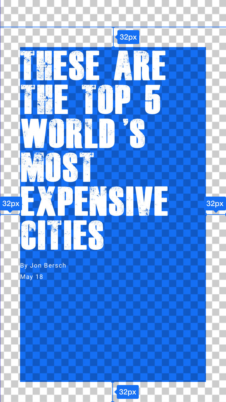
<amp-story-grid-layer template="fill">
  <amp-img src="cat.jpg" alt="..."></amp-img>
</amp-story-grid-layer>
vertical
The vertical template lays its elements out along the y-axis. By default, its elements are aligned to the top, and can take up the entirety of the screen along the x-axis.
Names Areas: (none)

<amp-story-grid-layer template="vertical">
  <p>Element 1</p>
  <p>Element 2</p>
  <p>Element 3</p>
</amp-story-grid-layer>
horizontal
The horizontal template lays its elements out along the x-axis. By default, its elements are aligned to the start of the line and can take up the entirety of the screen along the y-axis.
Names Areas: (none)

<amp-story-grid-layer template="horizontal">
  <p>Element 1</p>
  <p>Element 2</p>
  <p>Element 3</p>
</amp-story-grid-layer>
thirds
The thirds template divides the screen into three equally-sized rows, and allows you to slot content into each area.
Named Areas:
upper-thirdmiddle-thirdlower-third

<amp-story-grid-layer template="thirds">
  <p grid-area="middle-third">Element 1</p>
  <p grid-area="lower-third">Element 2</p>
  <p grid-area="upper-third">Element 3</p>
</amp-story-grid-layer>
Pre templated UI
Landscape half-half UI
The landscape half-half pre templated UI will resize the <amp-story-grid-layer> element to take half of the screen rather than the full screen, and be positioned either on the half left or half right of the viewport. This attribute only affects landscape viewports, and is ignored on portrait viewports.
This template makes it easier to design full bleed landscape stories: splitting the screen in two halves gives each half a portrait ratio on most devices, allowing re-using the portrait assets, design, and templates already built for portrait stories.
The position attribute on the <amp-story-grid-layer> element accepts two values: landscape-half-left or landscape-half-right.
supports-landscape mode to use this template. Example:

<amp-story-page id="foo">
  <amp-story-grid-layer template="fill" position="landscape-half-left">
    <amp-img src="cat.jpg" alt="..."></amp-img>
  </amp-story-grid-layer>
  <amp-story-grid-layer template="vertical" position="landscape-half-right">
    <h2>Cat ipsum dolor sit amet...</h2>
  </amp-story-grid-layer>
</amp-story-page>
Modern aspect-ratio
Responsive presets on grid-layers maximize usable screen space for foreground elements and scale assets consistently.
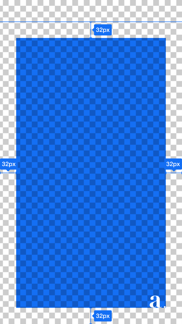
<amp-story-grid-layer preset="2021-background" template="fill">
    <amp-img src="cat.jpg" layout="fill" alt="...">
</amp-story-grid-layer>
<amp-story-grid-layer preset="2021-foreground">
    <h1>This will stay consistent with the bg</h1>
</amp-story-grid-layer>
<amp-story-grid-layer preset="2021-foreground" anchor="bottom-left">
    <!-- Position the icon close to the corner on all screens -->
    <amp-img src="icon.jpg" alt="..." style="bottom: 1em; left: 1em">
</amp-story-grid-layer>
Foreground
Use the 2021-foreground preset for foreground elements. This layer will always be fully visible and expand to the borders either horizontally or vertically, maximizing the size without cropping. The attribute anchor can be used to pin foreground layers to the page corners or borders, such that elements can be positioned relative to those borders or corners (which is useful for logos or footnotes).
Background
Use the 2021-background preset for the background layer. This preset covers the entire screen on most mobile phones with the background asset. It does so without letterboxing, and keeps positioning consistent with the foreground elements.
While this technique provides the most consistent user experience, it may crop up to 7% of one or all borders of your background. Keep this in mind when designing and picking your assets.
Znasz już ten dokument na wylot i nadal nie znajdujesz w nim odpowiedzi na wszystkie pytania? Być może inni przeszli to samo: skontaktuj się z nimi na Stack Overflow.
Przejdź do Stack Overflow Udało Ci się trafić na błąd albo brakuje jakiejś funkcji?Zdecydowanie zachęcamy do wzięcia udziału! Choć mamy nadzieję, że staniesz się stałym uczestnikiem naszej społeczności open source, to z wdzięcznością przyjmiemy również każdy jednorazowy wkład w kwestie, które są Twoją pasją.
Przejdź do GitHub