AMP Optimizer 的工作方式
AMP Optimizer 将有效的 AMPHTML 文档作为输入,并通过应用手动操作会非常麻烦的其他优化将其转换为优化版本。您可以通过 transformed 属性识别 html 元素中生成的转换 AMP:
<html ⚡ i-amphtml-layout i-amphtml-no-boilerplate transformed="self;v=1">
注:AMP 缓存使用不同的转换标记,例如,Google AMP 缓存添加了 transformed=google;v=1。
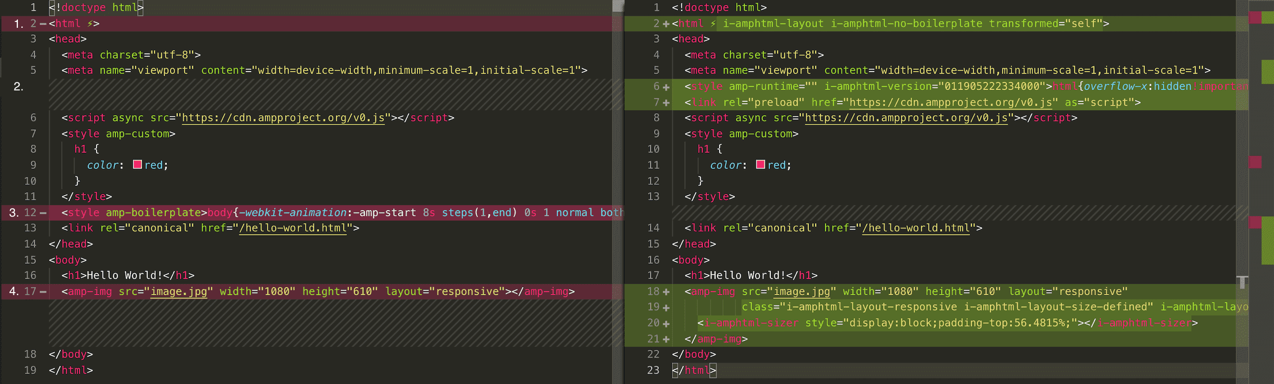
AMP Optimizer 对 AMP 文档执行包括从服务器端呈现布局到图片优化在内的各种优化。下面的示例显示了 AMP 网页与其优化版本之间的差异(点击查看放大版本)。
在本指南的其余部分,我们将更详细地介绍这些优化。
服务器端呈现 AMP 布局
在提高 AMP 网页加载性能方面,服务器端呈现 AMP 布局拥有最大潜力。为避免内容跳转,AMP 要求网站在标头中添加 AMP 样板代码。AMP 样板通过将页面主体的不透明度设置为 0 来隐藏网页内容。一旦加载完 AMP,便可计算网页的布局。之后,AMP 会将主体的不透明度设置为 1,使网页内容可见。遗憾的是,这种方式必须先下载 AMP 框架,然后才能呈现网页。
为了改善这一点,可以在将网页提供给用户代理之前在服务器端呈现 AMP 布局(例如 responsive 布局或 fixed-height 布局)。这样便可移除 AMP 样板,同时仍可避免网页加载期间发生内容偏移。
服务器端呈现执行以下三个操作:
1. 移除 AMP 样板:对于使用 AMP 布局的每个元素,将注入布局特定的标记。
2. Inline AMP-internal CSS styles: the AMP-boilerplate code is replaced by the AMP-runtime CSS styles:<style amp-runtime>...</style>. For non-server-side rendered documents, AMP adds these styles at runtime. However, server-side-rendered AMP pages require these for the AMP layouts to work before AMP has been loaded. To avoid potential version conflicts, at runtime, AMP will check if the version specified in i-amphtml-version="011905222334000" differs from the current AMP version and will update the CSS with the latest version if not.
<style amp-runtime i-amphtml-version="011905222334000">html{overflow-x:hidden!important}html.i-amphtml-...</style>
3. 服务器端呈现的 AMP 布局:对于使用 AMP 布局的每个元素,将注入布局特定的 sizer 元素。
<amp-img src="image.jpg" width="1080" height="610" layout="responsive"
         class="i-amphtml-layout-responsive i-amphtml-layout-size-defined" i-amphtml-layout="responsive">
  <i-amphtml-sizer style="display:block;padding-top:56.4815%;"></i-amphtml-sizer>
</amp-img>
警告:不能始终移除 AMP 样板。通过检查 html 元素上是否存在 i-amphtml-no-boilerplate 属性,可以确定样板是否已被移除。例如,amp-experiment 组件会在运行时更改网页内容。为了避免内容偏移,如果在网页上使用 amp-experiment,则需要提供 AMP 样板代码。
主打图片优化
AMP Optimizer 可以显著缩短在第一个视口中呈现图片所需的时间。在优化 LCP 时间以满足核心网页指标的要求时,这一点至关重要。
在 AMP 中,可以通过使用 data-hero 属性注解 amp-img 来显式声明主打图片:
<amp-img data-hero src="/hero.jpg" layout="responsive" width="640" height="480"></amp-img>
AMP Optimizer 在一个网页上最多支持两个主打图片,以避免阻塞其他关键资源的带宽。如果此限制对您无效,请告知我们。
AMP Optimizer 还会自动检测 amp-img、amp-iframe、amp-video 或 amp-video-iframe 元素的主打图片并为 src 图片注入 link rel=preload。自动检测通过分析 HTML 标记和图片布局来检测第一个视口中的大图片。
对于 amp-img,AMP Optimizer 还会在服务器端呈现 amp-img 内的 img 标记。这样一来,浏览器便可立即呈现图片,而无需 AMP 运行时。
图片优化
AMP Optimizer 可以通过生成 AMP 布局特定的 srcset 属性来帮助您提供经过优化的自适应图片。例如,以下 amp-img 声明:
<amp-img src="image1.png" width="400" height="800" layout="responsive"></amp-img>
通过以下 srcset 定义得到增强:
<amp-img src="image1.png" width="400" height="800" layout="responsive" srcset="image1.470w.png 470w, image1.820w.png 820w, image1.1440w.png 1440w"></amp-img>
为了使之生效,您的构建/托管环境需要支持调整图片大小/优化图片。查看有关如何以最佳方式集成图片优化的各个优化工具指南。
AMP 模块构建(即将推出)
我们基于 JavaScript 模块提供了一个较小版本的 AMP 运行时和相应组件,借助此运行时,用户在查看 AMP 网页时只需下载较少的 JavaScript。AMP Optimizer 默认启用 AMP 模块构建,方法是将:
<script async src="https://www.ampproject.org/v0.js"></script>
转换为:
<script type="module" async src="https://www.ampproject.org/v0.mjs"></script>
<script nomodule async src="https://www.ampproject.org/v0.js"></script>
理解 type="module" 的浏览器会忽略具有 nomodule 属性的脚本。这意味着使用新版浏览器的用户将从较小的运行时捆绑包中受益,而使用较旧浏览器的用户将回退到非模块版本的 AMP 运行时。
注:AMP 模块构建仅适用于转换 AMP,因为它需要内嵌 AMP 运行时 CSS。
-