How an AMP Optimizer works
An AMP Optimizer takes a valid AMPHTML document as input and transforms it into an optimized version by applying additional optimizations that would be cumbersome to do “by hand”. You can recognize the resulting “transformed AMP” in the html element via the transformed attribute:
<html ⚡ lang="en" i-amphtml-layout i-amphtml-no-boilerplate transformed="self;v=1">
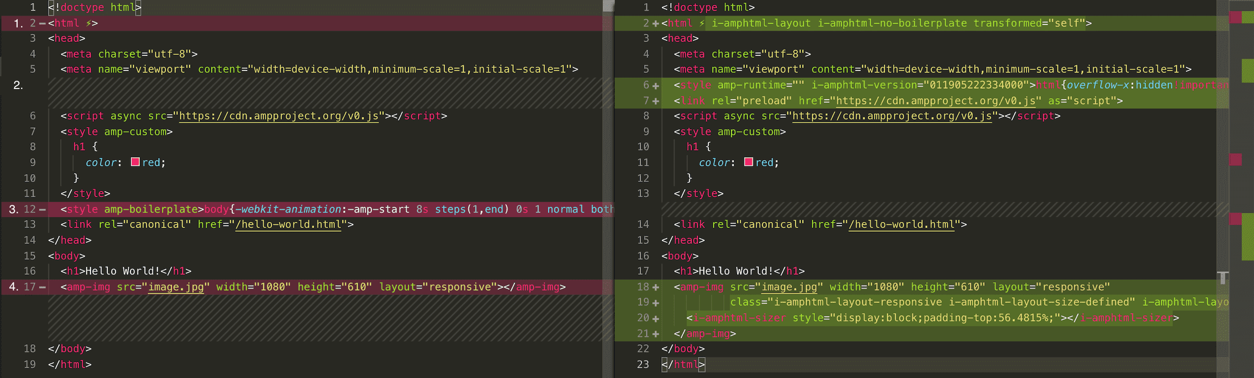
transformed=google;v=1. AMP Optimizers perform various optimizations on an AMP document ranging from server-side rendering layouts to image optimization. Here is an example showing the differences between an AMP page and its optimized version (click for a large version).
In the rest of this guide, we will introduce these optimizations in more details.
Server-side rendering AMP Layouts
Server-side rendering AMP layouts has the biggest potential to improve the loading performance of your AMP page. To avoid content jumps, AMP requires websites to add the AMP-boilerplate code in the header. The AMP-boilerplate hides the page content by setting the page body's opacity to 0. Once AMP has been loaded, it is able to calculate the layout of the page. After that, AMP sets the body's opacity to 1 making the page content visible. Unfortunately, this approach must download the AMP framework before it can render the page.
To improve this, AMP layouts, such as the responsive or fixed-height layout, can be rendered server-side before serving the page to the user agent. This way it becomes possible to remove the AMP-boilerplate while still avoiding content shifts during page load.
Server-side rendering does three things:
1. Remove the AMP boilerplate: for each element using an AMP layout, the layout-specific markup gets injected.
2. Inline AMP-internal CSS styles: the AMP-boilerplate code is replaced by the AMP-runtime CSS styles: <style amp-runtime>...</style>. For non-server-side rendered documents, AMP adds these styles at runtime. However, server-side-rendered AMP pages require these for the AMP layouts to work before AMP has been loaded. To avoid potential version conflicts, at runtime, AMP will check if the version specified in i-amphtml-version="011905222334000" differs from the current AMP version and will update the CSS with the latest version if not.
<style amp-runtime i-amphtml-version="011905222334000">html{overflow-x:hidden!important}html.i-amphtml-...</style>
3. Server-side rendered AMP layouts: for each element using an AMP layout, the layout-specific sizer elements gets injected.
<amp-img src="image.jpg" width="1080" height="610" layout="responsive" alt="..."
         class="i-amphtml-layout-responsive i-amphtml-layout-size-defined" i-amphtml-layout="responsive">
  <i-amphtml-sizer style="display:block;padding-top:56.4815%;"></i-amphtml-sizer>
</amp-img>
i-amphtml-no-boilerplate attribute is present on thehtml element. For example, the amp-experiment component changes page content at runtime. To avoid content shifts requires the AMP-boilerplate code needs to be present if amp-experiment is used on a page. Hero Image Optimization
An AMP Optimizer can significantly improve the time it takes to render images in the first viewport. This is critical when optimizing the LCP times to meet the Core Web Vitals.
In AMP, hero images can be explicitly declared by annotating an amp-img with the data-hero attribute:
<amp-img data-hero src="/hero.jpg" layout="responsive" width="640" height="480" alt="..."></amp-img>
AMP Optimizers support a maximum of two hero images on a page to avoid blocking bandwidth for other critical resources. If this limit does not work for you, please let us know.
AMP Optimizers will also auto-detect hero images for amp-img, amp-iframe, amp-video, or amp-video-iframe elements and inject link rel=preload for the image src. Auto-detecting works by analysing HTML markup and image layouts to detect large images in the first viewport.
In case of amp-img, AMP Optimizers will also server-side render the img tag inside the amp-img. This enables the browser to render the image straight away without the AMP runtime being required.
Image Optimization
AMP Optimizers can help you serve optimized responsive images by generating AMP Layout specific srcset attributes. For example, the following amp-img declaration:
<amp-img src="image1.png" width="400" height="800" layout="responsive" alt="..."></amp-img>
is enhanced with the following srcset definition:
<amp-img src="image1.png" width="400" height="800" layout="responsive" alt="..." srcset="image1.470w.png 470w, image1.820w.png 820w, image1.1440w.png 1440w"></amp-img>
For this to work, your build/hosting environment needs to support resizing / optimizing images. Checkout the individual optimizer guides on how to best integrate image optimization.
AMP Module Build (Coming soon)
There is a smaller version of AMP Runtime and components available based on JavaScript Modules which requires users to download less JavaScript when viewing an AMP page. AMP Optimizers enable the AMP Module build by default, by transforming:
<script async src="https://www.ampproject.org/v0.js"></script>
into:
<script type="module" async src="https://www.ampproject.org/v0.mjs"></script>
<script nomodule async src="https://www.ampproject.org/v0.js"></script>
Browsers that understand type="module" ignore scripts with a nomodule attribute. This means users with modern browsers will benefit from the smaller runtime bundles, whereas users on older browsers will fallback to the non-module version of the AMP runtime.
-